How Color Psychology Impacts Your Printed Materials

How Color Psychology Impacts Your Printed Materials

Have you ever wondered what colors tend to have customers reaching for one product over another? Or how the palette of your reception area leaves your guests feeling? Color impacts perception, both visual and emotional, and can be used to your brand’s advantage. Here’s a list of how your palette may influence your audience:

Red

Red has been shown to both speed up and intensify our reactions, making it ideal for fast and energetic visual communication. Positive traits associated are power, passion, energy, and excitement. It is often used in advertising for clearance sale tags, and stop signs to capture attention quickly.


Orange

The color of autumn leaves and pumpkins, orange is often associated with feelings of warmth and food. Its balance of red and yellow also lend use to drawing attention, but invoking a feeling of value with customers – making it a great choice for vouchers or coupons.

Yellow

Yellow, like red, is a color with a long wavelength and is often used as an attention-grabbing hue – such as for traffic signs or post-it notes. It is linked to feelings of optimism, happiness, and creativity.

Green

Green is the easiest on our eyes due to wavelength on the light spectrum, and thus it is associated with rest and calmness. We also associate it with nature and growth – brands that are eco-conscious could also be simply be referred to as being “green”.

Blue

Blue is another color associated with nature (think clear sky and calm waters), but it also evokes customer perception of trustworthiness. It’s no wonder that 33% of brands use it as a primary color in their branding packages!

Purple

Due to its uncommon appearance in nature and the historical rarity of natural purple pigments – like Tyrian purple—purple is a color associated with royalty, luxury, and sophistication.

Do the colors in your printed marketing materials convey the message you want to communicate to your customers? Contact our Launchpad design team today to perfect your palette!

CMYK vs RGB vs PMS – What Is The Difference?

CMYK vs RGB vs PMS – What Is The Difference?

RGB : Red Green Blue

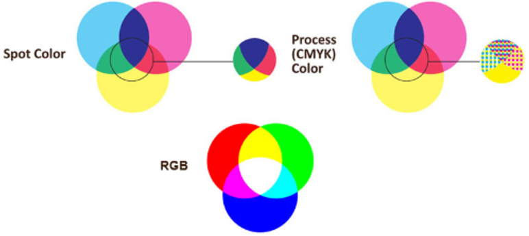
RGB stands for Red, Green, Blue. These three colors are essentially additive light colors that are used to make new colors. When all three are combined, it creates white. When no light colors are added, it shines black. The stronger the light intensity, the brighter and more vibrant the color appears. RGB colors are considered additive colors and added to a black screen.

When to use: RGB is often used by graphic designers and others who use computers to design art. RGB can only be used on screens and other technological devices. Due to some technology limitations, our computer screens, TV screens and other device screens can’t display every color our eyes are able to see. RGB offers more colors, that are more vibrant than CMYK.


CMYK: Cyan, Magenta, Yellow, Black

CMYK stands for Cyan, Magenta, Yellow and blacK,  and often referred to as 4-color process. It offers a larger scope of colors than RGB. Additionally, CMYK colors are considered subtractive colors and added to a white “screen”, or paper, to block out the light reflecting off paper. When adding cyan, magenta and yellow together, you would not get black unless adding them multiple times, causing more expense. Adding in a true black is time efficient and budget friendly. The CMYK color range allows for colors to be displayed more accurately and colors are presented in small, tiny, indiscernible dots to create the most accurate color possible.

When to use: CMYK is used on print materials such as paper, banners, apparel, promotional products and vehicle graphics. CMYK is best for photographs and designs that incorporate multiple colors or gradients


PMS: Pantone Matching System

PMS stands for Pantone Matching System and uses solid colors, sometimes known as spot colors. PMS colors are not recommended for color blending, as using multiple PMS colors can get expensive. Each Pantone color is solid and assigned a unique number to ensure consistency across print mediums. While you can convert PMS colors to CMYK colors, results often vary.

When to use: PMS is best used on logos and other branding, and best for projects with 1 to 3 solids colors without photographs or blending. It can be used to achieve colors outside the CMYK range of colors.


Color Process

When Best Used

Usage

Conversion

CMYK

Print Materials - especially with lots of colors Print Materials – good for blending, 2 or more colors, does not have to be solid artwork Can convert to RGB

RGB

Digital Designs Digital Screens Can convert to CMYK

PMS

Logos and Branding & Solid Colored Artwork Print Materials – no blending, 1-3 colors max, must be solid artwork Can convert to CMYK/RGB, but differences often occur

Resources: differencebetween.net, printernaational.org,

Cascade Print Media offers a wide range of options for both PMS and CMYK printing. We offer press checks upon request, so you can see your project being printed in real time, check the colors to ensure they match your branding standards, and get a tour of our facility!

Still not sure which option is best for you? Don't worry -- one of our printing experts would be happy to sit down with you to find the best options to meet your budget and ensure your project comes out exactly how you want it.