Looking for ways to go green, while still getting your message out there? We can help! From direct mail campaigns to environmentally friendly paper and inks, we are here to help every step of the way. Check out some tips below on just a few of the ways we can help you go green!
Mail invitations directly from us:
Did you know we can help with direct mailing? All we need is you list (or we can provide for you) and you’re all set! How does this help go green? One less delivery for us, one less thing on your to do list. Let us take the burden off you of having to go to the post office to mail everything out, ‘cause we are already going there. Plus, we may be able to help save you money on bulk postage rates!
Electronic proofs:
Electronic proofs are standard with all our jobs. We are happy to provide a hard copy proof, but delivery and mailing put stress on the environment with every step of the way. You will be able to see and fix any glaring mistakes, all from the comfort of your office or home. While the colors will not match exactly (colors on screen are different than on paper), they are similar enough that you will be able to spot any big mistakes.
Eco-Friendly Inks & Paper
Paper Facts: Paper is biodegradable and unlike water bottles, cell phones, computers and other electronic devices, it decomposes in a landfill.
Paper is made from cellulose fiber – that can come from pulped wood, rags, cotton, grasses, sugar cane, rice and waste paper. An estimated 4 million trees are planted daily and due to reforestation, forests in the U.S. have actually grown over the past century.
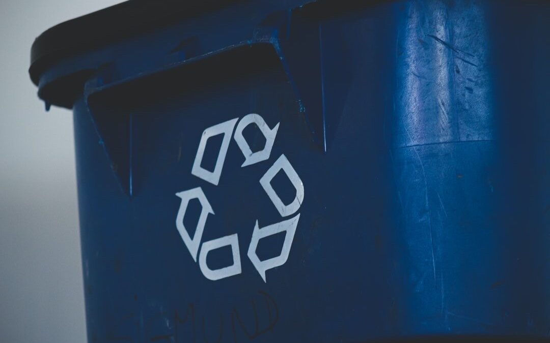
Paper is recyclable – 37% of the U.S. pulp is produced from recovered paper. Most recovered paper is used to make new copy and writing paper, as well as corrugated boxes, fruit cartons, egg cartons and wall insulation.
Ink – we use soy based inks that are compatible with the environment. This means less harsh chemicals in the environment and on your printed materials.
Economy Growth:
The forest products industry accounts for about 6% of the total us manufacturing output and employs more than one million people. It ranks among the top 10 manufacturing employers in 42 states. There are almost 175,000 establishments in this segment that employ over 2.9 million people. For comparison, the auto manufacturing industry only employs about 1.2 million
Efficiency:
Did you know that reading something on paper is 20-30% faster than reading something on a screen? Reading from paper results in deeper understanding of text and most end users prefer it. People are more likely to visit your store and buy something from a direct mail campaign then a simple email. If they can see it, touch it and read it, you have a bigger ROI than a simple email, which according to a survey, 80% of receivers automatically delete before ever opening the email.
Looking for more facts and ways to reach more customers? Check out some of our tips and tricks here and here.
References:
Whattheythink.com