Varnishes and How They Work

Varnishes and How They Work

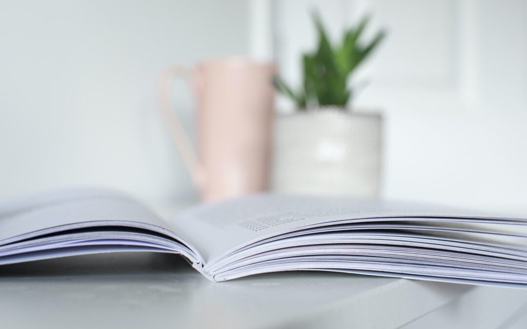
Varnish is a clear coating that is applied during the printing process that coats the sheet and protects the pieces against scuffing, fingerprints and helps enhance the colors for a more vibrant overall appearance. It is important to note that varnish can cause issues if you are mailing or later imprinting information on your piece, in this case you will use a knockout, where varnish is not coated in the areas of future imprinting.

Gloss varnish – this varnish is applied to help colors pop, it can be used over the entire sheet, or in specific areas to help images and colors be more vibrant. Although gloss is eye-catching, be aware that in bright lights or in the sun, it can cause glare making your product hard to read.

Satin Varnish – this is a mixture of both matte and gloss varnish, it provides a lighter coating, reduces glare but still allows protection against fingerprints and scuffing.  

Matte Varnish – this coating eliminates glare yet still provides protection to your material. Matte varnish is best used with materials with a lot of text making it easier for the audience to read. Matte varnish is often used for menu’s, instructions manuals and other readable materials.

Strike-through Matte – This coating is used to protect your sheet but also provide extra shine to images to help promote your product. The matte varnish is applied to the entire sheet except in areas where the gloss is used for a more impactful effect like images of products or taglines to catch the eye of your consumer.


Not sure where to start with varnish on your next project? We are happy to help! We will walk you through the process, give suggestions and can sometime provide samples for you to compare.

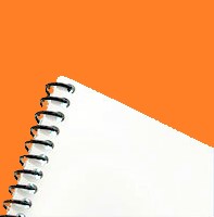
photo of card with spot varnish
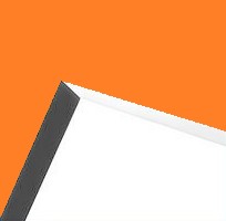
gloss varnish example
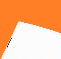
photo of matte varnish

Maximize Your Visibility: Power of Signage for Outdoor Events

Maximize Your Visibility: Power of Signage for Outdoor Events

Maximize Your Visibility: Power of Signage for Outdoor Events

In the world of marketing capturing the attention of potential customers is a paramount goal. Outdoor signage stands out as a potent tool especially for events. Their ability to project your brand message, attract attention effortlessly and ultimately drive foot traffic makes them invaluable for any business looking to make an impact.

Outdoor Strategies

When it comes to outdoor print BIG is the name of the game. This is where Cascade Print Media’s large format printing expertise can come in handy. Our designers can make sure your bold creative vision is properly displayed. Ensuring that your graphics come out crisp and clean for maximum impact.

Here are just a few ways to incorporate outdoor signage into your next event…

A-Boards

While excellent for street advertising they also work great at other venues, helping to attract attention in an easy to set up and portable way. With two inserts a sign you can make sure your message is seen from any angle. Available in a few standard sizes, Cascade can help supply the hardware and sign inserts. With replaceable inserts it’s a breeze to change out your message or have holiday or event specific messages.

Pull-Up Banners

While these excel at indoor events with a little extra preparation they can be used at outdoor events as well. Durable, portable and providing a large area for messaging and company branding there are an excellent large format choice. Designed to be used again and again so no matter what the venue your message will stand strong. When marketing needs change these can be updated. The hardware can be saved and new graphics installed to help reduce overall costs.

Posters and Signs

Whether indoor or outdoor, Cascade Print Media offers a range of media materials for all your signage, POS or retail needs. Available in a range of sizes, including recyclable options, you’re sure to find something that fits your needs. Whether it’s a lightweight one-day use sign, a medium-term use sign on a more durable substrate or something that can withstand harsh outdoor weather year after year Cascade can provide a suitable solution to help get your message across.

Branded Pop-Up Tent

Need to stand out at outdoor or community events? A branded tent will ensure you stand out among the sea of white tents. Whether you’re after simple text branding or a full color tent with custom sidewalls Cascade can help. With a bright and branded tent, you will ensure attention and foot traffic with the added advantage of easy setup and portability.

Partnering with Cascade Print Media can help you harness the potential of outdoor signage and carve out a distinctive space at your next event.

Major Mistakes to Avoid when Proofing a Print Project – Part 2

Major Mistakes to Avoid when Proofing a Print Project – Part 2

Part 2 —–

To make your print project a success, there are several mistakes to avoid during the proofing process. Part 1 of this series featured a couple of key mistakes to consider in proofing. This next part features several more:


Mistake 3: Color Reproduction

Most companies, brands, and organizations feature unique or distinct color schemes that are consistent across many areas of their operation, from packaging, to print materials, to their website and social media. Unfortunately, color is rendered differently across mediums: computer and phone screens render color using RGB, whereas most printers use the CMYK system to print colors onto a specific medium.

To maintain a specific color that all mediums can match to, many companies rely on the Pantone color system. Print companies can thusly rely on a Pantone color chart or book to depict the intended color that their printed version of the color can match.

Another helpful tool to use to ensure successful color reproduction is to rely on physical print samples that were printed in the correct color. At Cascade Print Media, we keep a few sample copies from most projects that we print. This way, we always have a sample of the last print we have done using a specific color scheme and know what the target color is for the next project. Clients can breathe easily knowing their color will maintain consistency across print projects for years to come.


Mistake 4: Low Resolution Artwork

Resolution in artwork refers to the number of tiny bits of color that come together to create an image. With printing, the industry standard method for measuring resolution is by using dpi, which stands for dots per inch. Many images found on a phone, or the web have a resolution of 72 dpi. This causes an issue because when printed, such low-resolution images will appear blurry, fuzzy, or pixelated. To guarantee clear, crisp images in printed materials, a resolution of 300 dpi is required. This setting can be set in most types of design software.

Additionally, it is never a good idea to stretch images to fill a space in a design or layout. This is because by stretching an image, you lower its dpi and thus reduce its print quality. However, no issues are caused by making images smaller, as long as the proportion of the image is kept consistent. If there are any concerns with image quality, a full-sized sample can be printed which will accurately depict how an image will look on a printed piece.

Cascade Print Media is committed to delivering print products of the highest quality to all of our clients. Please reach out to learn more about how we can produce and deliver an outstanding project for you today!

Major Mistakes to Avoid when Proofing Print Projects (Part 1)

Major Mistakes to Avoid when Proofing Print Projects (Part 1)

Part 1 of 2

Success in creating and delivering a compelling marketing campaign or outstanding print project starts before any of the ink hits the page. This is because before printing begins, there is a multi-layered process known as proofing that is meant to ensure everything that a client expects from their project is exactly what they will receive.

During this process, a designer takes a client’s design and creates what is known as a proof, or an exact replica or example of the finished product. It is up to the client to carefully inspect this proof to ensure it adheres to their particular specifications. Below are several key tips for avoiding costly mistakes in the print proofing process:

Mistake 1: Proofreading

One of the most important details to look out for and inspect in a proof is also seemingly the most simple: checking a proof for any and all spelling and grammar mistakes. It often goes without saying, but spelling, punctuation, and grammar mistakes in signs, graphics, and printed materials are some of the most common mistakes that can slip under the radar during the proofing process. To ensure that this doesn’t happen, it is recommended to slow down, read every word and phrase, and even show another individual the text and content that is to be printed. Spelling and grammar mistakes have the potential to negatively impact a client’s credibility in the eyes of the consumer or end-user by portraying them as being without care, organization, or precision.

Mistake 2: Layout and Alignment

There are two layout guidelines that should be considered with every print project: bleeds and cut lines.

Cut lines: This is where the printed piece will be cut after printing. It is important to design all important text, content, and graphics far enough away from the cut lines to ensure that they will not get cut off during the print production process. Similarly, if a printed piece folds, it is highly important to consider where the folds will go so that all content can align to the panel it will be folded within. Panels on the front and the back of a folded piece will need to align as well.

Bleeds: The backgrounds, borders, and fields of color of any printed piece should extend beyond the cut lines to ensure that there is no unintended white space around the edges of a printed piece. For instance, if you would like a design element to appear right at the edge of a piece, it will need to be extended beyond the cut line to ensure a seamless look and consistency amongst print pieces within the same project.


Check back next week for more tips on what to avoid when proofing out your print project! Ready to start your next project? Let us know!

What Is a Press Check

What Is a Press Check

A press check is a service offered by print companies allowing you to come to a review your print project once it is on press. The pressman will get everything setup and print a few sheets for you to review before hitting the go button on the entire project. This step is important for various reasons to ensure your print project comes out exactly how you want it. Below are a few important things to look for during your press check.

1 – Low Resolution Images

Images used for marketing are often pulled from online sources or images taken with a phone, these images can and most likely will print at a low resolution, meaning that once printed on a substrate, they can become pixelated or blurry. The standard print resolution for a print file is 300 dpi, many images online or from your phone can be only half of that or less, making them impossible to print at a larger scale than what shows on your phone or computer screen. When reviewing your project at a press check, this will give you a proper representation of the print quality for those images.

Image of low vs high resolution image. One pixelated, the other more clear

2 – Ink Registration

Most offset printing is done in CMYK, a process of 4 colors printed in layers to create a specific color image or text. If these colors are not in registration, you will be left with a blurry and hard to read piece. It is important to make sure there is perfect registration. Pressman will have a tool called a loop at their press; this tool allows you to magnify the print allowing you to see the registration. If these colors are off the pressman can adjust to get them realigned.

Image of good registration vs bad registration on page

3 – Color consistency

This is the process to which the colors are consistent across the entire sheet. Color management profiles are used to ensure color consistency throughout the printing process. Review your press sheet thoroughly and make sure the entire sheet is equally vibrant without any dull areas. If there are any issues with consistency, your pressman and prepress department can review and adjust the print management system.

Image of Press sheet being checked for consistency and registration

4 – FPO

FPO means FOR POSITION ONLY, when creating your digital print file, you may use an FPO for things such as die lines, foil stamps, scoring, punching or folds. These are important during the prepress process so we know how your art should be laid out to avoid any of the processes listed above from impeding into your final print piece (nothing is worse than trying to read text that is on a fold.) Most of the time these FPO are created in a bright pink, but not always. It is important to make sure your FPO has been removed from the press ready files, so your FPO is not printed in your final piece. FPO should be created as a separate layer in your file so it can be turned off when plates are made for printing.

Image of large sheet showing where cuts and folds will be on finished product

5 – Check Your Mailing Panel

Mailing panels are tricky, USPS has a lot of rules for mailing panels, such as size, position and the ability to inkjet. If your print piece has a coating such as Aqueous, UV, Soft Touch or any other coating, be sure the pressman has created what is called a knockout, this is a process where they keep the coating from being applied in the mailing panel area. If that area is coated, USPS will most likely reject your pieces causing you to reprint.

6 – Pagination

If you are printing a booklet, with multiple pages on a press sheet, it is important to fold that press sheet to make sure your pages line up properly when folded and stitched. The prepress department has programs that will assist with correct pagination, but it’s always at idea to manually check this for accuracy. Also keep an eye out for alignment, making sure your page numbers land in the same place when the sheet is folded on the crop marks, and there is no art in or around the spine. One last thing to look for, make sure the creep has been accounted for. When you have a large book that has multiple sigs, when those sigs are folded and nested together the outer most sigs will need to be adjusted so the art has more room on the spine, or the inner most pages are not pushed out too far that they get cut off when the final trim is made.

Example of book pages creeping out of book due to folds


Interested in starting your next project but don’t know where to start? We can help! Get in touch today and we can walk you through the process, step by step.

Promotional Products Return on Investment (ROI)

Promotional Products Return on Investment (ROI)

Promotional items

A study by the Advertising Specialty Institute found that “business promotional items are one of the most cost-effective advertising mediums for businesses.” The recall rate for promotional goods is around 89%, meaning that roughly 89% of customers can recall the advertiser on a promotional product they received within the past two years. A further 80% of people can also recall the messaging of the brand if they receive a promotional product from them. A physical item can also be much more effective than other types of campaigns. Promotional mugs and tumblers rank as more effective than radio/TV advertising. Studies report 57% of people can recall a brand’s advertising on a mug vs only 28% against recalling the advertiser on TV.

So why aren’t more businesses leveraging this growth opportunity?

One of the main reasons businesses may not be investing in corporate gifting or custom products is a perceived upfront cost. Certainly, depending on the products chosen, the upfront costs can look higher than expected. It’s important to consider more than just the raw cost when looking for promotional items.

Calculating ROI on promotional items

While not as easy to measure as a digital marketing campaign, this post challenges you to consider the ROI on promotional goods. The ROI is based on impressions – the number of people who are likely to see the branded product. When comparing investing into a marketing plan here’s a way to calculate the return on promo items.

No. of Items x Cost Per Item = Total Spend

Impressions per Product x No. of Items = Total Impressions

Total Spend / Total Impressions = Cost per Impression


Let’s break it down in a simple example using custom coffee mugs:


72 mugs x $10ea = $720

50 impressions ea x 72 = 3,600 views

$720 / 3,600 = $0.20 per impression


So, 72 mugs infrequently used only 50 times a year will get an estimated 3,600 impressions at an average cost of just $0.20 per impression. To put this in perspective the average CPC for Facebook advertising across all industries is roughly $2.00 per click.

With customers who consume coffee every day you could be looking at 72 x 365 or over 26,000 impressions a year. That takes the cost per view down to just $0.02 an impression. Those numbers don’t include others who might see the branding as well, which only drives down the impression costs even further.

Approx number of impressions

Clothing generates the most overall impressions over the expected lifetime of a product. The only exception being polo shirts, which can give the impression of a work uniform, making the wearers seem like employees and not casual users of the product. On average any product is expected to generate multiple hundreds if not thousands of impressions over its lifetime.

Know your target audience

Pick promotional products that your target audience will find useful or enjoy. Narrow in on products that are relevant to your business and will see use. Choosing well focused and quality products helps them stay around.

Approximately 87% of people keep promotional products for longer than a year while 4 out of 10 keep them for more than 5 years. That means people will continue to see your brand over and over, helping give you even more return on investment.


While at first glance promotional product expenses might seem more costly than alternative marketing options the actual cost per impression of promotional goods are extremely cheap. They provide long last lasting and consistent brand reminders to current and potential customers over a long lifespan.

Let Cascade Print Media help you grow your brand by offering solutions and options to stay in your customers’ minds while meeting your budgeting needs.


Sources: PPAI, ASI