Paper Grades and Weights
Paper Grades and Weights
Have you ever heard someone refer to the weight of a piece of paper? When getting printing quotes, do you call out what kind of paper you want, or do you leave that up to the printer to determine? There is no right or wrong answer, but see our tips below on typical paper weights, grades and uses.
Paper Grades:
Bond paper – most commonly used for letterhead, business forms and copying. Weights usually range from 20lb for copying or 24lb for stationary.
Text weight paper – most common in printing. This is typically high quality paper with some surface texture. Text paper can be coated or uncoated and weights are typically 60, 70, 80 or 100
Cover weight paper – used with creative business cards, postcards and booklet covers. These again can be uncoated or coated and weights are usually 65, 80 or 100.
Paper Weights:
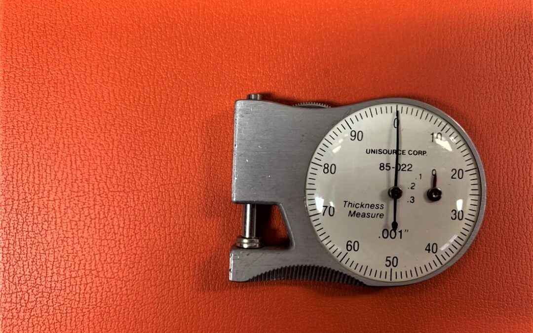
Paper weights are based on the weight (in pounds) of 500 standard sized sheets of paper. While there are many different terms and names to call out paper, there are some typical names across brands and companies. You can have a text or cover paper grade, with a same weight, that are not the same type of paper. For example, a 60lb text and a 60lb cover are two different types of paper.
Note that just because someone says “65lb” paper, they are not specifying the type of paper. Paper types need to be called out not only by weight, but also type. For example, “60lb text” or “100lb cover” are what you would see. Often times you can get even more fine tuned with saying “80lb cover uncoated”
Check out our articles here and here for more about uncoated vs. coated stock and more fun facts about paper!
![]()